The Influence of Colors on Artistic Expression: How the Palette Affects Emotions and Perceptions
The Power of Color in Art
In the realm of artistic expression, color transcends mere aesthetics; it serves as a profound medium of communication. Each color embodies a distinct psychological weight, shaping the audience’s experience and the creator’s intention. When an artist selects a specific hue, they are not just making a stylistic choice; they are tapping into a rich tapestry of emotions and cultural meanings. For instance, the choice of a bright red can invoke urgency and passion, while a soft blue can elicit feelings of serenity and trust.
The Emotional Spectrum of Colors
Colors are not arbitrary; they resonate with our inner feelings and perceptions, often triggering profound emotional responses. Here is a deeper exploration of how specific colors are perceived:
- Red: Often associated with passion and energy, red can ignite excitement, but it can also signify anger or danger. Artists like Mark Rothko have famously utilized red to convey intense emotional landscapes.
- Blue: This color tends to calm the viewer, inspiring feelings of trust and tranquility. Iconic works by artists like Claude Monet often use blue to evoke peaceful natural scenes, making viewers feel more connected to their environment.
- Yellow: A bright and cheerful color, yellow is linked to joy, optimism, and creativity. Vincent van Gogh’s vibrant sunflowers exemplify how yellow can uplift the spirit and stimulate creative thought.
- Green: Symbolizing growth and renewal, green helps create an atmosphere of stability. In American art, landscapes showcasing lush greenery often connect viewers to themes of nature and revitalization.
- Purple: Historically linked to royalty and spirituality, purple conveys a sense of luxury and mystery. Contemporary artists like Kehinde Wiley use purple in their portraits to convey depth and complexity in identity.
This diverse array of colors provides artists with a valuable toolkit to express intricate narratives and emotions. In the United States, the use of color is often intertwined with cultural themes, reflecting the diverse backgrounds and experiences of its artists and their audiences.
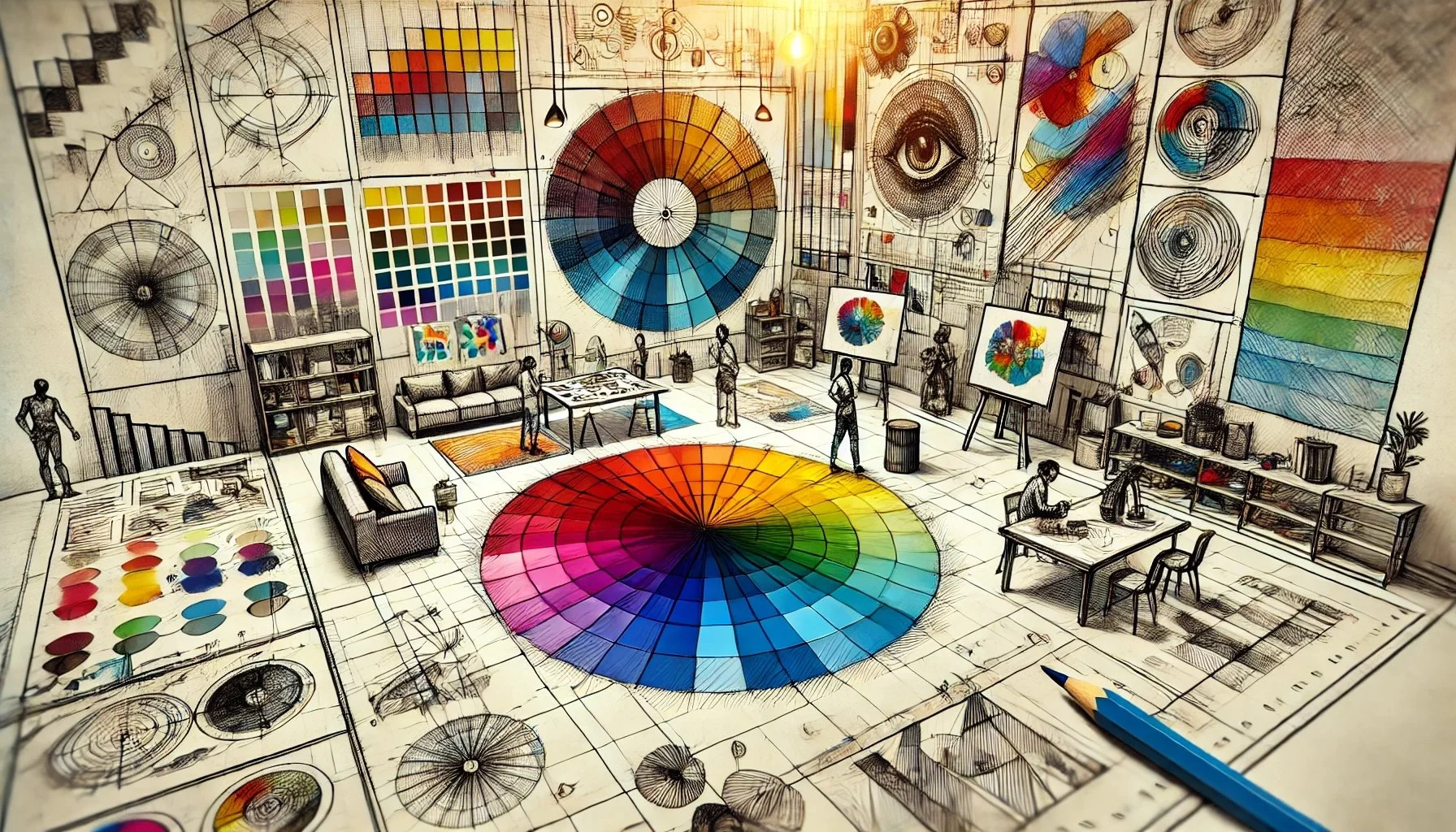
Color Theory and Its Application
Understanding color is integral to the crafting of effective and evocative art. This is where color theory comes into play, offering a framework through which artists can make informed choices. Essential components of color theory include:
- The color wheel and complementary colors: These concepts allow artists to create contrast and vibrancy in their works.
- Warm vs. cool colors: Warm colors tend to energize, while cool colors calm, helping artists create dynamic compositions that resonate on different emotional levels.
- Color harmony: This principle is key for creating aesthetically pleasing artworks that maintain viewer engagement, often enhancing the viewer’s experience and emotional response.
By mastering these elements, artists can adeptly manipulate viewer perceptions, imbuing their work with specific narratives and feelings. The intricate relationship between color and emotion not only enriches artistic expression but also deepens our understanding of art as a universal medium of communication. As we engage with art, we are often guided by the unspoken language of color, an invitation to explore the hidden depths of human experience.
DISCOVER MORE: Click here to learn how music lessons can make a difference
Unveiling the Hidden Messages of Colors
The selection of colors in art is rarely a random occurrence; rather, it is a calculated decision steeped in intentionality and meaning. Artists harness the psychological impact of colors to evoke specific emotions and guide perceptions. This depth of manipulation isn’t just a matter of personal preference; it plays a critical role in shaping how a work is perceived and experienced by its viewers. Understanding this process is crucial for appreciating the inherent messages conveyed through color.
The Psychological Impact of Color Choices
Colors can transcend language, speaking directly to our emotions on a subconscious level. Each hue comes with its own set of connotations, influencing not only how we feel but also how we interpret the world around us:
- Orange: A dynamic blend of red and yellow, orange exudes warmth and enthusiasm. It is often used in advertisements to stimulate excitement and invite engagement. Artists like Andy Warhol embraced this color in their pop art, reflecting the vibrancy of consumer culture.
- Black: Often perceived as a color of mystery and power, black can evoke dramatic tension and sophistication. In the works of artists like Georgia O’Keeffe, the use of black can bring an element of depth and chiaroscuro to floral compositions, inviting contemplation.
- White: Symbolizing purity and simplicity, white is used effectively by minimalist artists to inspire clarity and peace. The iconic works of Donald Judd exemplify how the absence of color can be a powerful statement in itself.
- Brown: A color representing earthiness and stability, brown can elicit feelings of warmth and comfort. It has been a prominent choice for artists portraying natural landscapes, connecting viewers to the earth and their roots.
- Pink: Associated with love and compassion, pink adds a soft touch to art, often reinforcing themes of tenderness and affection. Artists like Yayoi Kusama incorporate pink in their works to explore the relationships between humanity and nature.
These colors do more than decorate a canvas; they weave a complex narrative that resonates with cultural and emotional undertones. For artists in the United States, where cultural diversity reigns, choosing specific colors can reflect individual backgrounds and the unique stories they wish to convey. The impact of colors can vary widely based on societal contexts and personal experiences, effectively bridging connections between creators and their audiences.
Color and Cultural Significance
The cultural significance of color cannot be overstated. A palette’s emotional weight is deeply embedded in the collective conscience of society, often shaped by historical and social influences. For instance, green is frequently associated with environmental movements in the United States, representing a commitment to sustainability and nature conservation. Artists like Ansel Adams have employed rich greens in landscapes to not only showcase the beauty of nature but also advocate for its preservation.
Through careful analysis of color’s nuances, artists can navigate and challenge societal norms, utilizing their palettes as tools for commentary. As viewers, engaging with art through the lens of color allows us to unravel the deeper meanings and emotional layers that comprise the full spectrum of artistic expression.
The Psychological Effects of Color in Art
Colors are not just aesthetic choices; they evoke emotions and significantly influence how art is perceived. Various psychological studies have revealed that different colors can trigger specific feelings or mental associations. For instance, red may evoke feelings of passion or urgency, while blue often instills a sense of calm or tranquility. Artists are keenly aware of these associations, utilizing them strategically to enhance their narratives or thematic elements effectively.Moreover, cultural contexts can alter the interpretation of colors. While white is often associated with purity in Western cultures, it may symbolize mourning in others. This complexity adds layers to artistic expression, inviting viewers to engage with pieces on a deeper level. Artists such as Van Gogh and Matisse are known for their deliberate use of color to convey emotional depth, leaving audiences to grapple with their psychological implications.
Color Theory in Artistic Creation
Understanding color theory is essential for artists who wish to harness color’s capability to communicate emotions. The color wheel, which organizes hues based on their relationships, can guide artists in choosing complementary or contrasting colors to enhance their work’s emotional impact. The textit{triadic color scheme}, which uses three evenly spaced colors on the wheel, can create a vibrant, dynamic composition that attracts the viewer’s eye. Additionally, the concept of warm and cool colors further shapes emotional responses. Warm colors, such as reds and yellows, generally energize and excite, while cool colors, like greens and blues, tend to be calming and soothing. This knowledge empowers artists to craft more engaging works capable of evoking the desired response from their audience.As we delve deeper into the realm of colors and their implications in art, it’s essential to remember that the interpretation is subjective. Each viewer brings their own experiences and emotions to their understanding of color, allowing for an infinite range of responses to a single piece. The influence of color in artistic expression does not merely end in the visual; it seeps into our perception and emotional engagement with art, making it a richer, multidimensional experience.
EXPLORE MORE: Click here to discover the value of manual skills for creativity
The Role of Color Theory in Artistic Expression
As we delve deeper into the influence of colors on artistic expression, it is essential to consider how color theory informs and enhances artists’ choices. Color theory is a systematic approach to understanding how colors interact, and it provides artists with a framework for creating visual harmony, contrast, and emotional resonance. Developed over centuries, this theory combines the physical properties of color with cultural and psychological aspects, providing invaluable insights into the way colors affect emotions and perceptions.
The Color Wheel: Foundation of Artistic Palette
At the heart of color theory lies the color wheel, a circular diagram that categorizes colors into primary, secondary, and tertiary groups. This wheel serves as a fundamental guide for artists, allowing them to understand how colors relate to one another. For example:
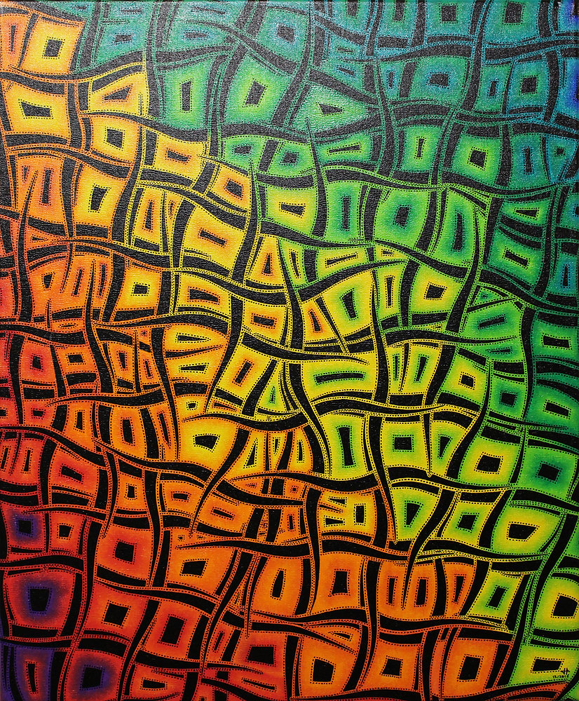
- Complementary colors: Colors positioned opposite one another on the color wheel, like blue and orange, create dynamic tension and excitement when used together. This contrast can be seen in the vivid landscapes of artists like Vincent van Gogh, whose swirling skies often juxtapose vibrant yellows against deep blues.
- Analogous colors: Colors that are next to each other on the wheel, such as blue, blue-green, and green, create a sense of harmony and unity. Artists like Claude Monet utilized these palettes to evoke serene landscapes, as seen in his ‘Water Lilies’ series, where gentle hues blend seamlessly together.
- Triadic colors: This scheme involves using three colors that are evenly spaced on the wheel, such as red, yellow, and blue. This combination provides vibrant contrasts and is often employed in works that aim to convey a sense of liveliness and vitality.
Understanding these relationships allows artists to manipulate color combinations effectively, creating moods that range from energetic and vibrant to calm and muted. The intentionality behind color selections can profoundly impact how viewers engage with the artwork.
Emotional Resonance and Personal Expression
Every artist has their own unique experiences and emotional landscapes that influence their color choices. For instance, the use of bold and saturated colors might reflect an artist’s exuberance and joy, while more subdued tones could signify introspection and melancholy. Mark Rothko, known for his large color field paintings, skillfully employed this emotional resonance. Rothko’s use of deep reds and dark blues invites introspection and evokes feelings of spirituality and contemplation, creating an immersive experience for the viewer.
Moreover, artists often draw upon personal or collective experiences to connect with their audiences. In contemporary art, for example, artists like Kara Walker utilize stark contrasts in their color palettes to comment on race relations and historical narratives, delivering a powerful message through color. The deliberate selection of color not only represents personal identity but also opens up dialogues about broader cultural contexts.
As artists wield their palettes with intention, viewers are encouraged to engage more deeply, exploring the emotional weight embedded in hues and tones. This relationship not only enriches one’s appreciation of the artwork but also fosters a more profound understanding of the artist’s narrative and intent.
In seeking to decode the influence of colors on artistic expression, it becomes apparent that the choices artists make reflect both individual sensibilities and the collective fabric of society, illuminating the nuanced ways in which color garners emotions and shapes perceptions.
DIVE DEEPER: Click here to discover delicious local recipes
Conclusion: The Multifaceted Impact of Color on Artistic Expression
In exploring the influence of colors on artistic expression, it becomes clear that color is not merely a visual element but a powerful emotional language that artists utilize to convey their narratives and ideas. Artists, like seasoned communicators, employ the principles of color theory to craft experiences that resonate with viewers on a profound level. Understanding the color wheel and its various schemes enables artists to create harmonious compositions or striking contrasts, thereby eliciting a broad spectrum of emotions.
As examined through the works of renowned painters such as Vincent van Gogh and Kara Walker, color choices reflect personal histories and societal issues, bridging connections between the artist’s intent and the viewer’s perception. Furthermore, the emotional resonance of colors is multifaceted, capable of invoking feelings that range from joy and serenity to introspection and critique. Such depth invites audiences to engage not just with the visual aspects of a piece but with the underlying messages it conveys.
In conclusion, the palette of an artist is a crucial tool in shaping emotional landscapes and cultural dialogues. As we continue to appreciate and analyze art, an awareness of how color influences artistic expression enriches our understanding of both the artwork and the stories behind it. Each brushstroke and hue serves as a reminder of the vibrant interplay between color, emotion, and human perception, encouraging us to delve deeper into the world of art and explore its many nuances.